
Quiet the Noise, Here’s the Data:
Our “Quiet the Noise” and “Emotion is Out…” mantras can serve you right now, more so than any economic outlook that is disconnected from the market’s current movement. Look to the logic–the DATA behind our methodology to educate you as to where we might be and where markets may be going in 2016.
Or, you can listen to Harvard educated, best-selling author and economist, Harry Dent– who is calling for the Dow to plunge to 6,000 (NOTE: the Dow is currently at 16,000).
SIDEBAR; Harry called for Dow 35,000 in 1998 and we’ve only seen Dow 18,351). Let’s just for simplicity’s sake put him in the “Noise category.” Poor Harry’s been wrong too many times, and its a shame how many books he sells and how many investors he panics. I guess fear does sell.
Is there any truth to Mr. Dent’s noise? Let’s see.
Below you will find a “temperature reading” on the market and the risk level on the field.
Relative Strength of the Asset Classes:
Q4 2015 Asset Scale Activity:
- No material changes in the asset class line up from Q3 to Q4.
- Domestic Equities/Stocks continue to pave the way, followed by Fixed Income in the #2 spot, and Cash closes Q4 at the #3 spot.

1/1/2016 Status:
- #1 Asset Class: Stocks/Domestic Equities
- #2 Asset Class: Bonds/Fixed Income
- Market Status: BULL (yes, Bull NOT BEAR)
- NYSE Bullish Percent (NYSE BP): DEFENSE @ 36% (below 30% represents low equity risk, above 70% high risk) Reversed down @ 43.21% on 12/8/2015.
NOTE: as of this writing, 1/26/2016, the NYSE BP is at 21% levels NOT seen since Q4 2011. While the noise is quiet loud at this NYSE BP level, stocks won’t stay at 21% on the NYSE BP (signaling that only 21% of stocks are on a “buy” signal) for very long–in fact, the S&P 500 rallied 19.14% a year after the NYSE BP reversed up from the last time it was at 20% in October of 2011.
Much can be said about the above Asset Scale lineup and our mother of all risk indicators, the NYSE BP.
Simply put, however, with only one equity asset class in the top 2 positions, and with more “risk-off” assets moving up the asset scale — Cash, Bonds and Currencies firmly dethrone International Equities (now in the #5 of 6 spots). We find ourselves in a semi-defensive posture, with our 100% equity clients, for example, invested in bonds and cash, and our typical bond clients holding a higher percentage of bonds and cash than usual. A small, small nod to Harry.
Only a small nod though.
While stocks remain in the #1 spot, considering the uncertainty of that position, I foresee bonds taking over that position this quarter or perhaps next (there’s your 2016 Outlook). We will continue to keep our toes, cautiously, in equities. Not running for the hills with Harry, just yet.
What to Watch For:
Again, we will be watching to see if US Equities/Stocks will give up the #1 spot it has held since 2011.
In order for that to happen, we will have to see Stocks/Domestic Equities give up Relative Strength buy signals versus other asset classes. Don’t get bogged down in jargon here–a picture is worth a thousand words…see below.
In the first 2 weeks of the year Stocks have already given up almost 40 buy signals, falling from 341 down to it’s current reading of 302 (see below).
Note that a good bit of these signals have been handed over to Bonds/Fixed Income–which has picked up about 13 buy signals, and to Cash which has picked up about 18 buy signals. Currencies are responsible for picking up the rest. With that said, the leadership is shifting to defensive asset classes, away from stocks. We consider this, DATA—not noise. This data is based on pure price performance, not on what some economist or Wall Street analyst “thinks.”

Should Domestic Equities fall out of the #1 spot, we would cut our holdings in stocks. All portfolios would see their allocations with even more cash and bonds than at year-end.
As long as Domestic Equities remain in the #1 or 2 spot– We will continue to have our toes in the water, wading through the high-quality names that will continue to bring stability and growth to your accounts. This remains true with bonds as well, despite the tense interest rate environment.
Furthermore, with Commodities (GOLD and OIL) firmly rooted in the last position on the Asset Scale– We took a “short” position (a “short” or inverse Oil ETF—exchange traded fund—will go up when oil goes down) in oil in late December. This position is up as much as 40% (DUG, DTO) and has helped cushion clients from the recent downturn, alongside cash and bonds.
In fact, our “short” position in oil, cash and bonds have aided our portfolios in outperforming the major indices over the last 3 months and year-to-date (YTD), and in many cases has resulted in positive performance in 2016 aside the S&P 500’s losses of -8% YTD.
Our Hedge Model, It’s What Makes Us Different:
Our investment strategy utilizes a Relative Strength measurement that tells us which asset classes are performing the best, coupled with a Hedge strategy for “risk-off times” that helps us wade through good markets and bad. As such, our performance won’t always mimic major market returns, like the S&P 500, which we affectionately call the “broken yardstick” of performance measurements. However, In the long-term we will mimic the major market benchmarks and outperform.
While it is common during intra-bull market cycles to see times of under performance, it is also common that when fundamental sell-offs occur (usually every 36 months)–that we will outperform major markets, hence, offering long-term out performance. It is these fundamental sell-offs that our indicators will offer us meaningful guidance in our Hedge Model and otherwise.
Some corrections, while not deemed meaningful, we participate in (August 2015), others we side step (December 2015 – Current). Consequently, we have very happy clients right now given the meaningful signals we honored back in December. And, we had meaningful signals in 2008, early, so remember that we’ve got you managed.
Why the Sell Off?
As often as this happens (every 18 months becomes very often after 20 years in the biz!), the phenomenon has to be addressed with newbies to our methodology, and understandably so.
You see, every 18 months or so the market will correct at least 10%– And, you may know, about every 3 or so years the market usually experiences a 20%+ decline. We’ve been fortunate enough to have not seen a true market correction of 20%+ since the 2008 recession. This is where my broken yardstick rhetoric comes into play.
Investors want to use the S&P 500 as their yardstick, or benchmark, until it offers -38% return in two months time, as it did in the Fall of 2008. Hence why we deem the benchmark, or yardstick, that investors want to often measure themselves to, as broken. At times this yardstick works– But in other times, like 2008, for example, investors wanted to use cash as their yardstick (to stop their losses)!
Alphavest’s Hedge Model, the cornerstone of how we deliver ALPHA and a better yardstick.

It has been proven that avoiding an opportunity for loss is preferred over an opportunity for gain.
What Would You Choose?
Science describes an experiment showing just how strongly human behavior will change if the feeling of loss is introduced.
In this study, participants were given $50 at the start. Then they were asked to choose between one of the 2 options:
1) Participant is guaranteed to keep $30.
2) Or the participant may gamble, with a 50/50 chance of losing or keeping the entire $50.
Results? Participants acted in a risk-averse way, with 57% choosing to keep the $30.
And so it is with our indicators, our methodology and our clients; risk of loss guides our portfolio’s investments, and as we avert major downturns, it aids in our long-term out performance.
In other words, when the indicators validate Mr. Dent’s gloom and doom, we’ll honor them and go to the sidelines.
What Happened in 2015 & the Bottom Line:
With most markets ending lower for the year, over 80% of active managers, under performed their benchmarks in 2015.
YTD Performance 2015

The returns for indexes, ETFs, futures, and stocks do not reflect dividends and are based on the last sale for the date requested. Returns for mutual funds do account for distributions. Performance data does not include all transaction costs. Past performance is not indicative of future results. Potential for profits is accompanied by possibility of loss.
Despite a decent fourth quarter, equity markets, across the globe, had a volatile year in 2015. After the summer correction in the S&P 500, US stocks snapped back quickly. This was a surprise to many investors who were looking for the end of one of the longest bull markets on record. After the snapback, equities moved in a very tight trading range to close out the year. Fixed Income, or bonds, AGG in the above chart, finished the fourth quarter down slightly, despite interest rate hike fears and ended the year -1.92%. Commodities, led by oil, continued their sell off and were the worst performing class of the year. The trouble in commodities also affected emerging markets, which finished the year down -16.96%.
Most investors were left scratching their heads and wondering why it was so difficult to make money in 2015. According to data from Societe Generale, 2015 was the hardest year to make money in 78 years. Nasdaq traded stocks–mostly tech in nature, were the best performing asset class for the year. 2015’s environment was very difficult for hedge funds (which we mimic as opposed to your buy and hold pie chart advisory firm) and traditional asset managers, alike.
A lot of the momentum out performance this year came from what momentum strategies avoided rather than what they held–however, a great deal of under performance came from not owning the infamous FANG stocks. Contradictory, yes? Yes.
The Federal Reserve finally took action and raised interest rates by 0.25% during the fourth quarter. The move was long awaited, and had been put off due to market volatility and concerns about the health of the global economy. It is important to keep in mind that even with the recent hike, rates are still historically quite low. There are studies that show that stocks are not as affected as you might think until rates get up around 5%, and we are a long way from that now. This may be more of a problem for the bonds in our portfolios versus stocks, but only time will tell–but we remain confident that our indicators will tell us first.
The 2016 Market State of the Union:
As the bull market we find ourselves in continues to age, we expect a few things to happen that will be positive for our portfolio’s methodology. First, we are going to continue to hear more cries that the market is “expensive.” This usually affects “valuation” based strategies visa vie relative strength based strategies, such as ours. Second, the market will continue to show leadership in fewer places–a narrowing, if you will, a natural and totally expected occurrences this bull market continues. A narrow market is positive for our strategy because we can overweight the small pockets of strength that are performing well and avoid the areas that are weak–or “short” extreme weakness, as we did with oil.
While last year’s 2015 Outlook in the Q1 newsletter addressed economic and world factors that may or may not affect the market. The tone of 2016 has been so sharp, with Oil and China woes at all time highs, it feels most prudent to honor the most important of our “mantras” of our methodology, which are “quiet the noise” and “emotion is out, logic is in.”
What does all that mean? I’m saying that unless you lived under a rock in 2015, you know that oil and China are significant factors in a 2016 Outlook. Most investors right now are concerned with the question of; When will the market will bottom out and go back up?
Markets and economies don’t move in tandem, as one would think. In fact, they do the opposite and that’s confusing in an “Outlook” to investors. I often blog about Liz Ann Sonders’ of Schwab, and her excellent piece on the market disconnect. See the disconnect between US GDP growth and market returns below:
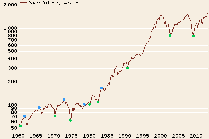
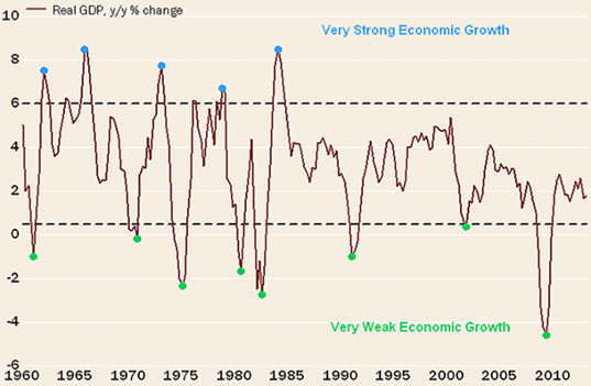
Source: Charles Schwab & Co.
Note the above illustration are the opposite directions of GDP growth and stock market returns.
Bottom line:
Levels this low have happened only 23 times over the past 60 years — meaning, this field position comes along roughly once every three to four years.
The take-away here; the market seems to be close to the bottom of this sell-off. Stay tuned for the reversal in our blog alerts and look out for our bi-weekly VLOG, “Quiet the Noise” which exposes media Noisemakers (ahem, guess who we expose first)—coming soon!
Portfolio Changes:
Resources, Resources, Resources!
Check out our Resources page at Alphavest.com and explore the many ways in which we are empowering investors.
A Snapshot of What’s There:
Morningstar™ Fee Analysis. Learn just how much you pay each year in fees and help others to educate themselves on what they pay too! Did you know that excessive fees can amount to upwards of 21% of your wealth over a 20-30 year period? We are committed to offering the lowest fees possible and want all of our clients to know what they are paying.
Free Consultations with Cokie. Those who have used this offer have found it beneficial and have been pleased with the value 15 minutes of their time provides. We use this resource to offer investors a no-pressure opportunity to assess whether Alphavest is a good fit. This is a great place to send those that you think may need our services. Thank you for your referrals and consideration!
FINRA Advisor Background check. FINRA reports that only a small percentage of investors check their advisor’s record before making a switch. We run background checks on our employees, our childcare providers — why not run one, it’s FREE — on the person who manages your money? Rest assured our record is spotless (click here for Cokie’s U4). The important feature of the report is that it will indicate “NO DISCLOSURES,” which means no fraud or investor complaints.
Subscribe to Cokie’s Blog!
Most of my blogs are less than 200 words (except this quarter! FWEH!) — short and sweet! I post as a means of quick and efficient communication with you, my clients. Your feedback is very important to me. THANK YOU for letting me know what you like reading… and what you don’t!
Q4 Most Read Blogs:
- Santa Baby
- MLP Reversal Underway

Join the Liberated Investor Movement Today!
We launched the Liberated Investor Movement in an effort to educate investors on how to break free from being held hostage by “Big Brokerage.”
The Liberated Investor Tool Kit exposes five areas of the investment management industry where the deck is stacked against investors and offers simple and direct advice:
- Excessive Fees and What Can Be Done About Them
- The Myth of Buy and Hold
- The Emotion Behind Market Timing
- Industry Conflicts of Interest
- How to Hire An Advisor That’s On Your Side
Download the Tool Kit today and share with your Facebook community and friends and family!
The best way to refer us? Tell others to download the FREE The Liberated Investor Tool Kit: